Toto: Dog Walking App

Summary
The dog walking industry reached $1.3 billion in 2023 and forecasts predict the global pet car market will reach $358.62 billion by 2027. I wanted to understand problems users are facing when it comes to dog walking apps and what solutions I could come up with to help make the lives of pet owners easier. I divided this project into three phases, 1. Empathise, 2. Discovery, and 3. Design guiding me to develop solutions that effectively addressed user pain points, leading to a more intuitive and user-friendly experience.
Key Outcomes
Designed a start-to-end experience to help dog owners connect with dog walkers. Increased usability and validated designs through user testings.
Solutions
Finalized a prototype version that streamlines the app's booking form for a more positive experience for dog owners and dog walkers alike.
My Role
UX Researcher - UX Designer
Problem
Dog owners are busy and need to connect with dog walkers nearby to help care for their pets.
Project Tag
student
Empathize
At the start of this project I had no idea what my users needed from dog walking apps, but I knew I needed to answer three key questions.
1. What are their current frustrations and pain points?
2. What do they really want?
3. What do they really need?
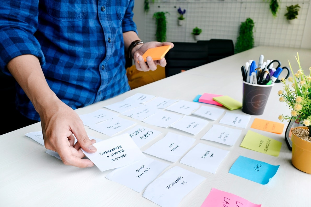
Research & Key Findings
10 survey responses and 10 Interviews
User Interview and Survey Insights
1. Users prefer to ask friends and family they trust to watch their pet
2. Pet owners prefer to communicate before booking
3. Most users will ask friends or family before using a pet sitting service
Competitive Research
1. Consistent booking builds trust
2. Users need an easy schedule process
3. Customizable search preferences allows for higher retention rates
Discovery
Excited with insights, I moved forward to form a strategy.
First, I needed to understand the key pain points, wants, and needs of our target users. Second, I needed to classify all the insights I gathered and then bucket them into categories to understand the priorities of each key finding. Eventually, I finalized a primary persona that reflected our target audience.
Casey Thomas
27 years Old
Denver, CO
Nurse Practitioner
Backstory
Casey is single and works as a nurse practitioner at Denver Health. He lives alone with his dog, Lilly, and spends about 40+ hours at work. In his free time, he enjoys hanging out with friends and taking Lilly to dog parks. Casey cares for Lilly deeply and wants to give her the best life possible, but finds it challenging when he's working overtime every other week. He doesn't want Lilly to be cooped up all day but also doesn't want to hand her off to a random stranger through an app service.
Goals
To have peace of mind that Lilly is receiving the love and attention she needs while he's at work.
Secondary Research
Affinity Maps, Customer Journey, and User Flows, Oh my!
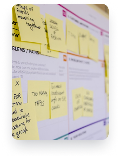
Three key things I did in this stage:
- Created affinity maps to understand our audience.
- Plotted customer pain points, wants, and needs in a journey map to help me prioritize features I wanted to focus on in the design stage.
- Document research and present it in a way that guides future design decisions.
Affinity Map Insights
- users need easy scheduling and booking
- users want to establish trust with their new dog walker
- users want the convenience and flexibility of finding a dog walker in their area
Journey Map Insights
- user journey starts with booking a dog walker
- the booking process can be location or reviewed based
- dog owners want to stay updated on how their dog is doing
Key Takeaways
- in-app messaging
- location-based searching
- save time booking verified dog walkers
Design
The deadline was quickly approaching, and I needed to start designing soon. Three main area objectives helped guide my design decisions.
Objectives
- Prioritizing the user’s needs at first open.
- Design principle screens and main features that help users accomplish their primary goal–booking a walk.
- Create a visual language users trust, empowering them to navigate the app and communicate with dog walkers easily.
Design Goals
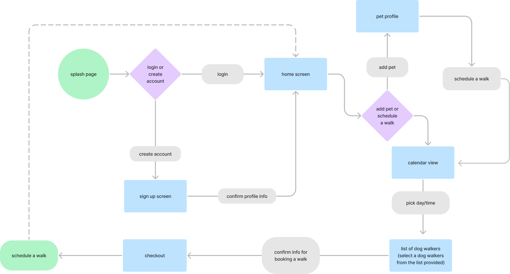
- Designed the booking-dog-walk experience as our primary user flow.
- Conceptualized principle screens.
- Tested a V1 prototype.
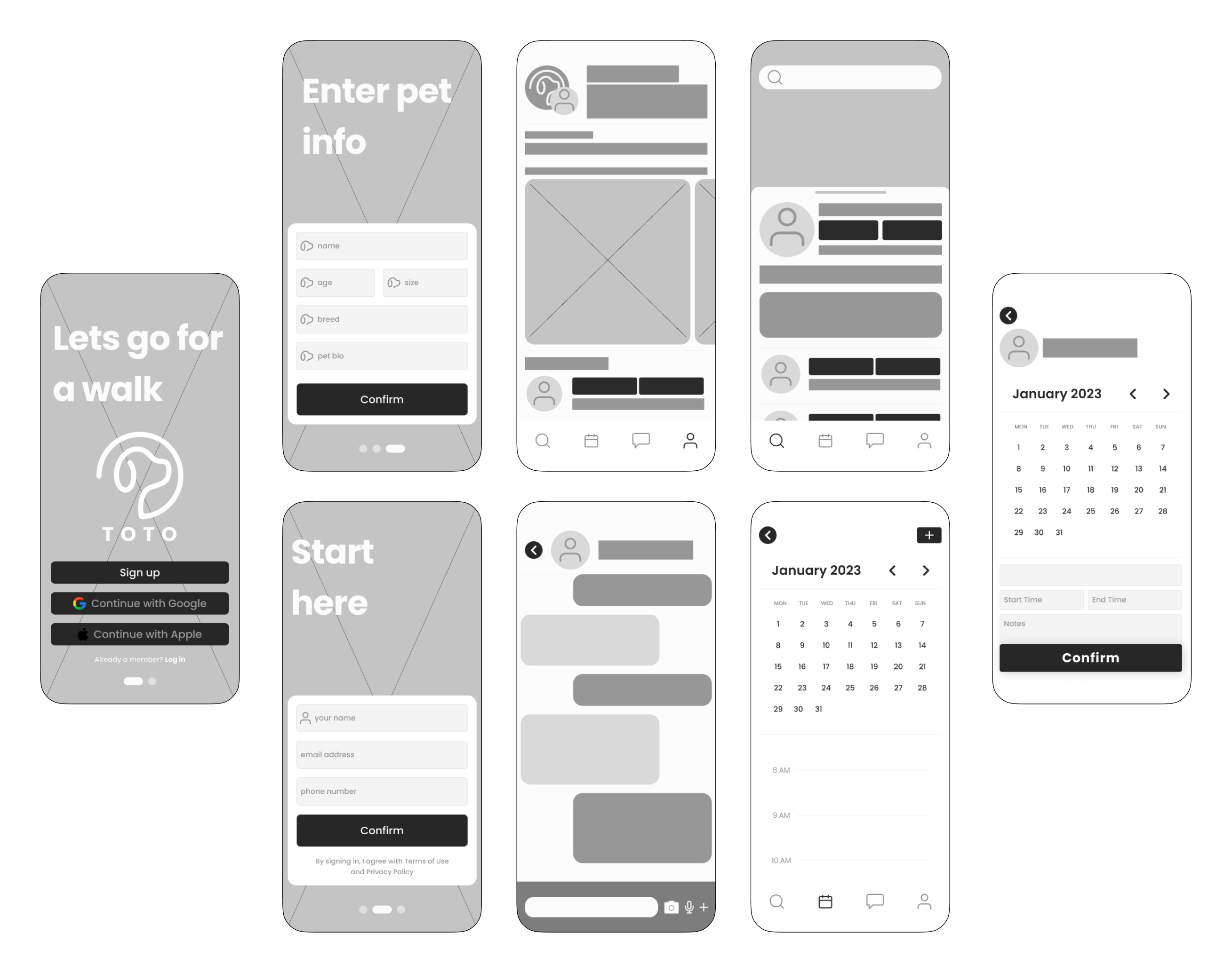
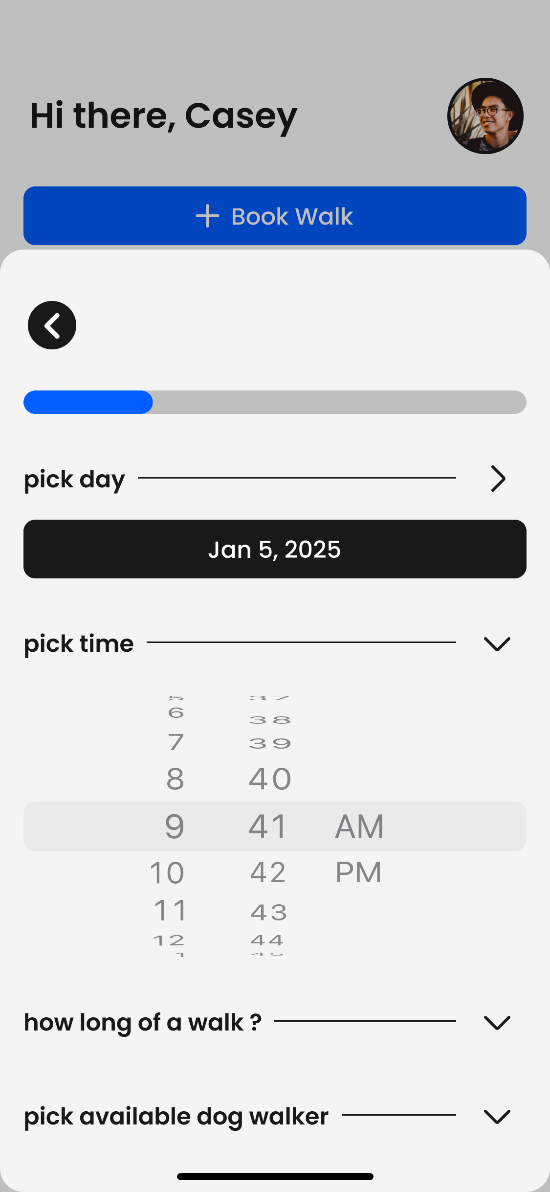
Usability Testing
Tested V1 with five dog owners in a series of moderated usability testing sessions and found three emerging problem areas in the initial design.
- The search bar felt optional on the booking form, and most users forgot it was there to help them search for a walker.
- Four out of five participants were frustrated when booking a walk, and almost all users felt unsure of what action to take on the booking form.
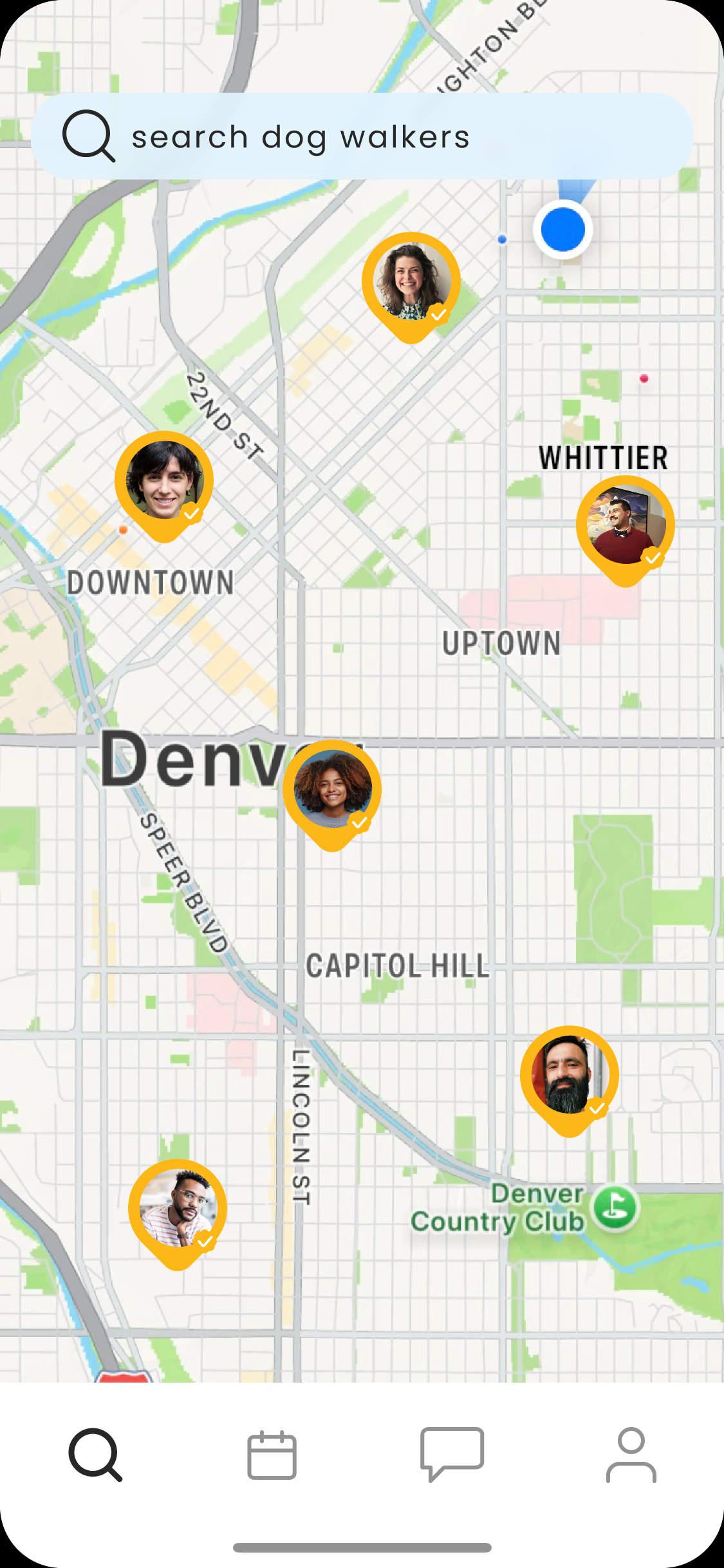
- The map screen was confusing, and almost all participants wanted to start with a list view and have the option to toggle on and off the map.

Search Bar

Date Select

Time Select

9:41

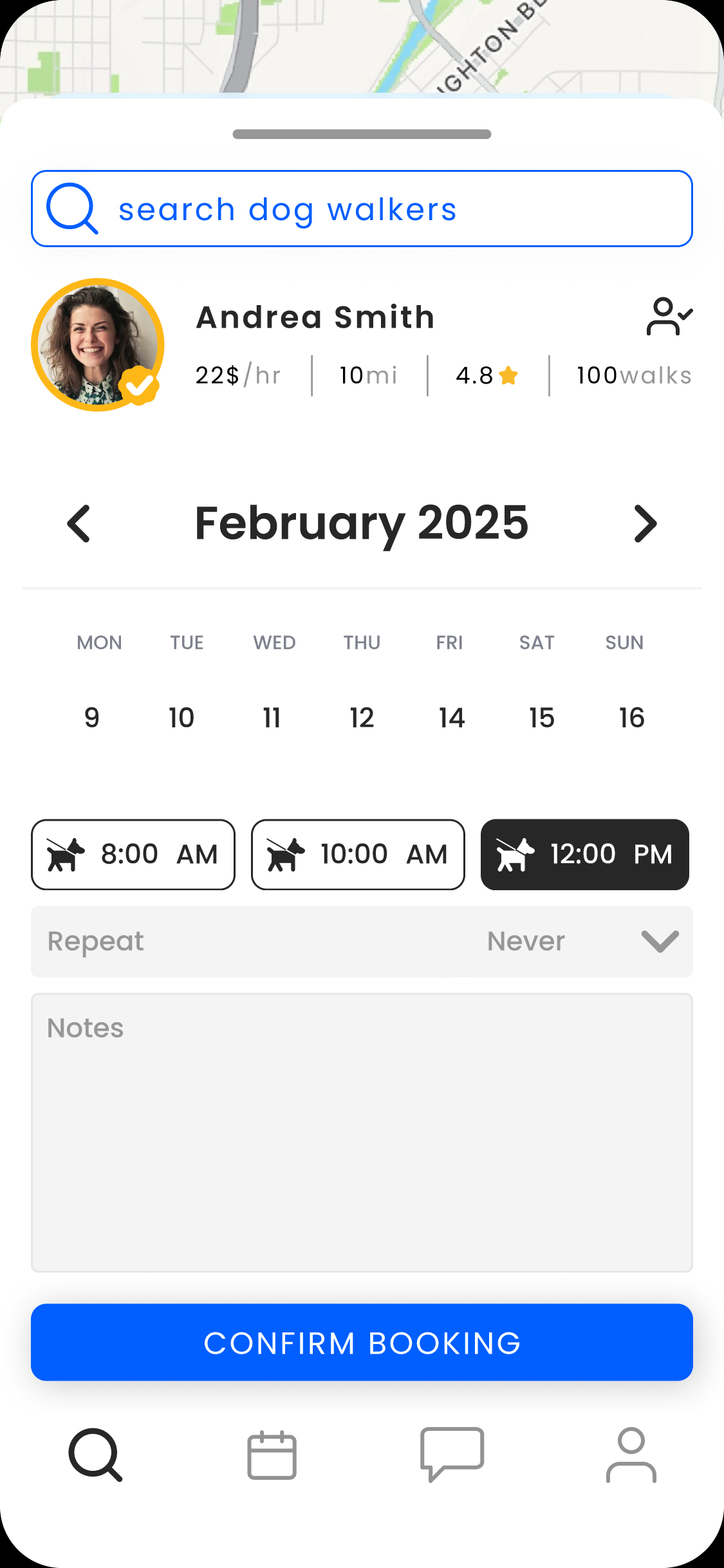
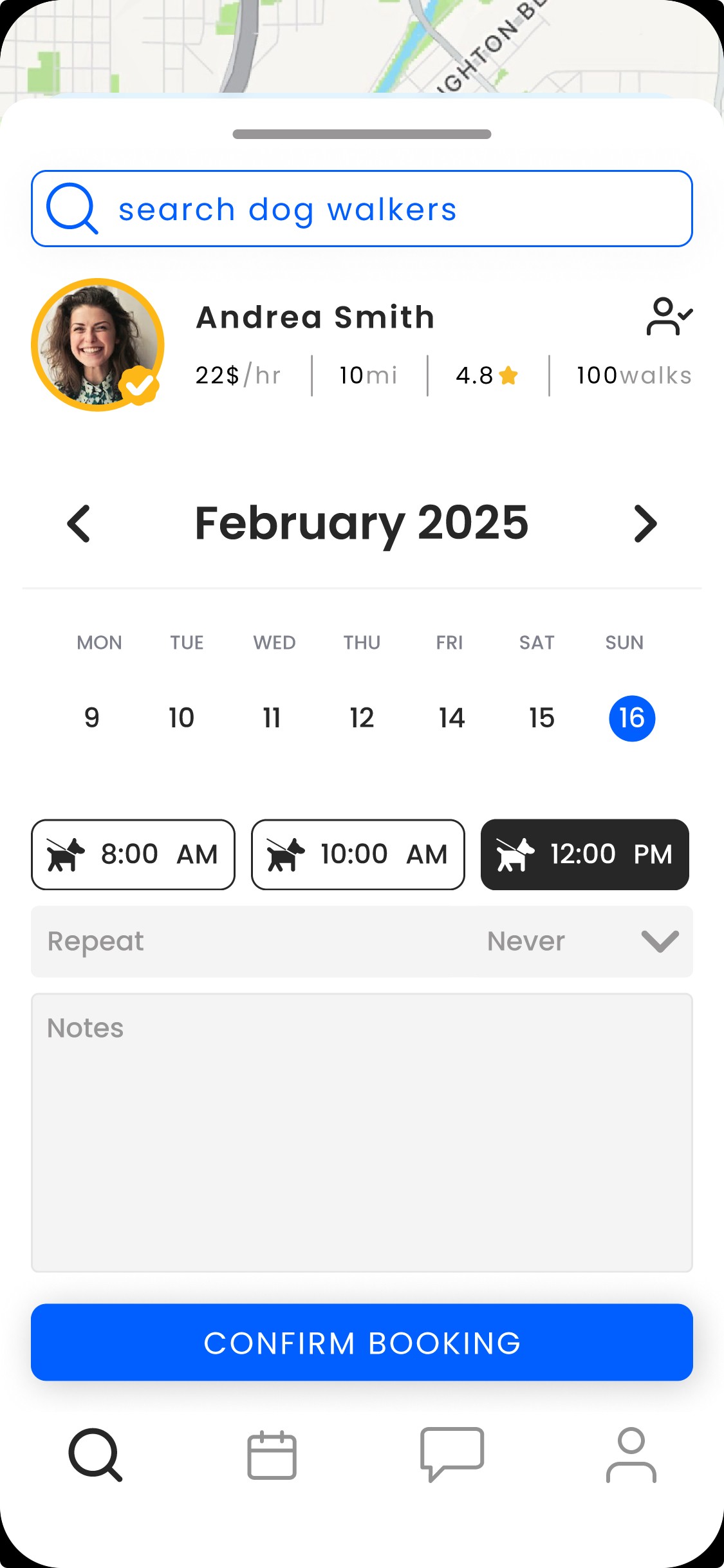
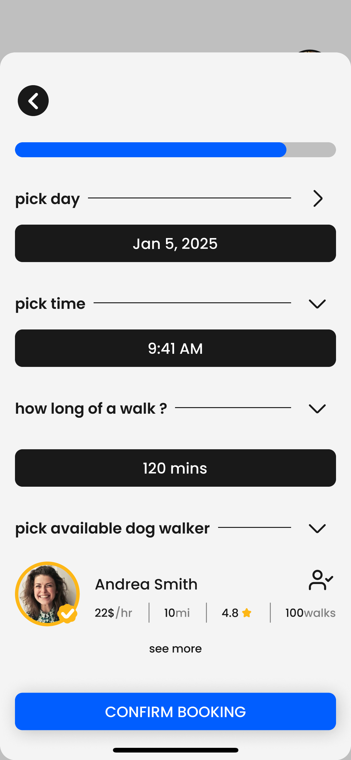
Final Design
Improved prototype V2 by applying user feedback in three ways.
9:41
- Divided each task of the booking form using visual hierarchy.
- Designed the search screen to prioritize dog walkers in a list format.
- Finalized a design system that reflects changes.
Specific feature/flow hightlights
- Booking a walk is quicker in just a few steps.
- Search bar is now integrated into the user flow as a necessary step.
- Search screen prioritizes the list view with the option to maximize the map view.

9:41


9:41

Design Systems
My goal was to formulate a file structure that can scale and work well with other in a development setting.
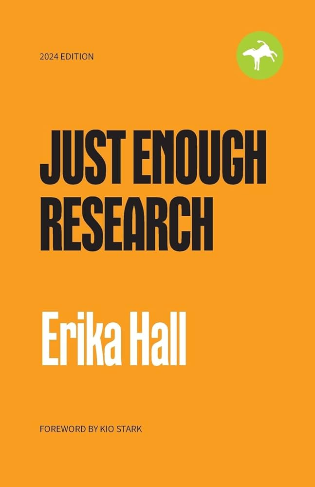
In my approach to learn more I sought out resources to deepen my knowledge on crafting design systems and landed on the book, Design Systems, by Alla Kholmatova.
This book guided me to three design principles I used to take this project from start to finish.
Design Principles:
Practical, Purposeful, Real
I used these principles to guide my design process, leading me to audit my entire design to single out the necessary patterns and behaviors of each UI element. I then rebuilt my existing screens atomically from molecules to organisims and collected everything into three pages,
Foundations, Components, and Patterns.
I moved quickly to tokenize everything so the finished design can be scaled and modified as needed.
Learnings
I could write a separate case study on all the lessons I learned on this project, but I’ll narrow it down to just three.
- Stay Organized & Log Progress
Each and every milestone in this project should have been documented so that I could refer back to it later when writing this case study.
- Do Research
I spent entirely way too much time designing UI screens that weren’t validated by user research only to go back and learn that the screens and features I had spent hours on made no sense. There was a point in this project where I had to throw away my initial design and start from scratch, but only after I conducted enough research to truly understand the needs of my users.
- Design Atomically
Doing the proper amount of usability testing allowed me to see firsthand the patterns and behaviors of my users. Once I understood the core journey of my users I was able to rebuild my screens atomically, completed with a foundation for making quick changes like switching out components, and going from dark mode to light mode.
While the final designs aren’t perfect, I’m ready to close this project and apply the UX fundamentals I learned here to my next case study.

Books that helped me through this project
Reach me at:
karsonhallaway@gmail.com

Work
Toto: Dog Walking App
UMS App Redesign

Toto: Dog Walking App
Summary
The dog walking industry reached $1.3 billion in 2023 and forecasts predict the global pet car market will reach $358.62 billion by 2027. I wanted to understand problems users are facing when it comes to dog walking apps and what solutions I could come up with to help make the lives of pet owners easier. I divided this project into three phases, 1. Empathise, 2. Discovery, and 3. Design guiding me to develop solutions that effectively addressed user pain points, leading to a more intuitive and user-friendly experience.
Key Outcomes
Designed a start-to-end experience to help dog owners connect with dog walkers. Increased usability and validated designs through user testings.
Solutions
Finalized a prototype version that streamlines the app's booking form for a more positive experience for dog owners and dog walkers alike.
My Role
UX Researcher - UX Designer
Problem
Dog owners are busy and need to connect with dog walkers nearby to help care for their pets.
Project Tag
student
Empathize
At the start of this project I had no idea what my users needed from dog walking apps, but I knew I needed to answer three key questions.
1. What are their current frustrations and pain points?
2. What do they really want?
3. What do they really need?
Research & Key Findings
10 survey responses and 10 Interviews
User Interview and Survey Insights
1. Users prefer to ask friends and family they trust to watch their pet
2. Pet owners prefer to communicate before booking
3. Most users will ask friends or family before using a pet sitting service
Competitive Research
1. Consistent booking builds trust
2. Users need an easy schedule process
3. Customizable search preferences allows for higher retention rates
Discovery
Excited with insights, I moved forward to form a strategy.
First, I needed to understand the key pain points, wants, and needs of our target users. Second, I needed to classify all the insights I gathered and then bucket them into categories to understand the priorities of each key finding. Eventually, I finalized a primary persona that reflected our target audience.
Casey Thomas
27 years Old
Denver, CO
Nurse Practitioner
Backstory
Casey is single and works as a nurse practitioner at Denver Health. He lives alone with his dog, Lilly, and spends about 40+ hours at work. In his free time, he enjoys hanging out with friends and taking Lilly to dog parks. Casey cares for Lilly deeply and wants to give her the best life possible, but finds it challenging when he's working overtime every other week. He doesn't want Lilly to be cooped up all day but also doesn't want to hand her off to a random stranger through an app service.
Goals
To have peace of mind that Lilly is receiving the love and attention she needs while he's at work.
Secondary Research
Affinity Maps, Customer Journey, and User Flows, Oh my!
Three key things I did in this stage:
- Created affinity maps to understand our audience.
- Plotted customer pain points, wants, and needs in a journey map to help me prioritize features I wanted to focus on in the design stage.
- Document research and present it in a way that guides future design decisions.
Affinity Map Insights
- users need easy scheduling and booking
- users want to establish trust with their new dog walker
- users want the convenience and flexibility of finding a dog walker in their area
Journey Map Insights
- user journey starts with booking a dog walker
- the booking process can be location or reviewed based
- dog owners want to stay updated on how their dog is doing
Key Takeaways
- in-app messaging
- location-based searching
- save time booking verified dog walkers
Design
The deadline was quickly approaching, and I needed to start designing soon. Three main area objectives helped guide my design decisions.
Objectives
- Prioritizing the user’s needs at first open.
- Design principle screens and main features that help users accomplish their primary goal–booking a walk.
- Create a visual language users trust, empowering them to navigate the app and communicate with dog walkers easily.
Design Goals
- Designed the booking-dog-walk experience as our primary user flow.
- Conceptualized principle screens.
- Tested a V1 prototype.
Usability Testing
Tested V1 with five dog owners in a series of moderated usability testing sessions and found three emerging problem areas in the initial design.
- The search bar felt optional on the booking form, and most users forgot it was there to help them search for a walker.
- Four out of five participants were frustrated when booking a walk, and almost all users felt unsure of what action to take on the booking form.
- The map screen was confusing, and almost all participants wanted to start with a list view and have the option to toggle on and off the map.

Search Bar

Date Select

Time Select
9:41
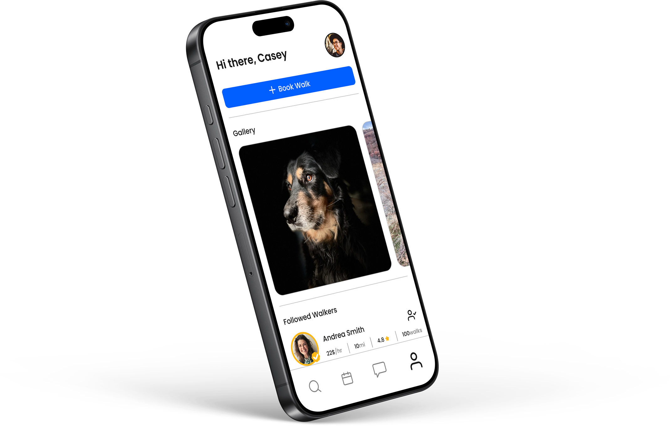
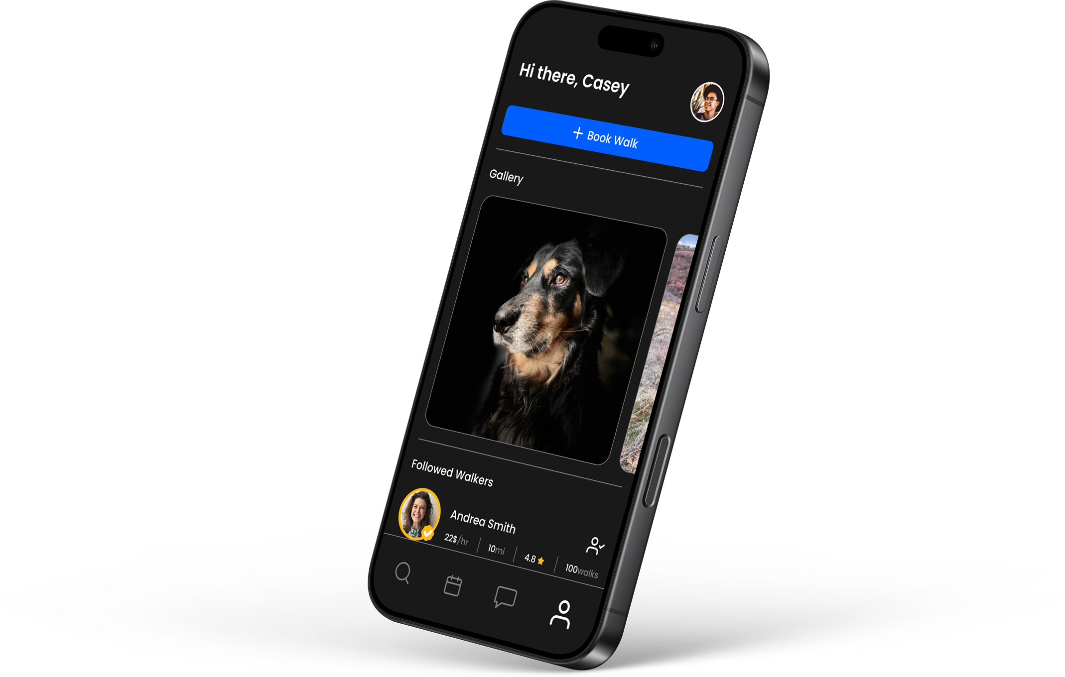
Final Design
Improved prototype V2 by applying user feedback in three ways.
9:41
- Divided each task of the booking form using visual hierarchy.
- Designed the search screen to prioritize dog walkers in a list format.
- Finalized a design system that reflects changes.
Specific feature/flow hightlights
- Booking a walk is quicker in just a few steps.
- Search bar is now integrated into the user flow as a necessary step.
- Search screen prioritizes the list view with the option to maximize the map view.
9:41
9:41
Design Systems
My goal was to formulate a file structure that can scale and work well with other in a development setting.
In my approach to learn more I sought out resources to deepen my knowledge on crafting design systems and landed on the book, Design Systems, by Alla Kholmatova.
This book guided me to three design principles I used to take this project from start to finish.
Design Principles:
Practical, Purposeful, Real
I used these principles to guide my design process, leading me to audit my entire design to single out the necessary patterns and behaviors of each UI element. I then rebuilt my existing screens atomically from molecules to organisims and collected everything into three pages,
Foundations, Components, and Patterns.
I moved quickly to tokenize everything so the finished design can be scaled and modified as needed.
Learnings
I could write a separate case study on all the lessons I learned on this project, but I’ll narrow it down to just three.
- Stay Organized & Log Progress
Each and every milestone in this project should have been documented so that I could refer back to it later when writing this case study.
- Do Research
I spent entirely way too much time designing UI screens that weren’t validated by user research only to go back and learn that the screens and features I had spent hours on made no sense. There was a point in this project where I had to throw away my initial design and start from scratch, but only after I conducted enough research to truly understand the needs of my users.
- Design Atomically
Doing the proper amount of usability testing allowed me to see firsthand the patterns and behaviors of my users. Once I understood the core journey of my users I was able to rebuild my screens atomically, completed with a foundation for making quick changes like switching out components, and going from dark mode to light mode.
While the final designs aren’t perfect, I’m ready to close this project and apply the UX fundamentals I learned here to my next case study.
Books that helped me through this project
Reach me at:
karsonhallaway@gmail.com
Work
Toto: Dog Walking App
UMS App Redesign
Toto: Dog Walking App
Summary
The dog walking industry reached $1.3 billion in 2023 and forecasts predict the global pet care market will reach $358.62 billion by 2027. I wanted to understand problems users are facing when it comes to dog walking apps and what solutions I could come up with to help make the lives of pet owners easier. I divided this project into three phases: 1. Empathize, 2. Discovery, and 3. Design, guiding me to develop solutions that effectively addressed user pain points, leading to a more intuitive and user-friendly experience.
Key Outcomes
Designed a start-to-end experience to help dog owners connect with dog walkers. Increased usability and validated designs through user testings.
Solutions
Finalized a prototype version that streamlines the app's booking form for a more positive experience for dog owners and dog walkers alike.
My Role
UX Researcher - UX Designer
Problem
Dog owners are busy and need to connect with dog walkers nearby to help care for their pets.
Project Tag
student
Empathize
At the start of this project I had no idea what my users needed from dog walking apps, but I knew I needed to answer three key questions.
1. What are their current frustrations and pain points?
2. What do they really want?
3. What do they really need?
Research & Key Findings
10 survey responses and 10 Interviews
User Interview and Survey Insights
1. Users prefer to ask friends and family they trust to watch their pet
2. Pet owners prefer to communicate before booking
3. Most users will ask friends or family before using a pet sitting service
Competitive Research
1. Consistent booking builds trust
2. Users need an easy schedule process
3. Customizable search preferences allows for higher retention rates
Discovery
Excited with insights, I moved forward to form a strategy.
First, I needed to understand the key pain points, wants, and needs of our target users. Second, I needed to classify all the insights I gathered and then bucket them into categories to understand the priorities of each key finding. Eventually, I finalized a primary persona that reflected our target audience.
Casey Thomas
27 years Old
Denver, CO
Nurse Practitioner
Backstory
Casey is single and works as a nurse practitioner at Denver Health. He lives alone with his dog, Lilly, and spends about 40+ hours at work. In his free time, he enjoys hanging out with friends and taking Lilly to dog parks. Casey cares for Lilly deeply and wants to give her the best life possible, but finds it challenging when he's working overtime every other week. He doesn't want Lilly to be cooped up all day but also doesn't want to hand her off to a random stranger through an app service.
Goals
To have peace of mind that Lilly is receiving the love and attention she needs while he's at work.
Secondary Research
Affinity Maps, Customer Journey, and User Flows, Oh my!
Three key things I did in this stage:
- Created affinity maps to understand our audience.
- Plotted customer pain points, wants, and needs in a journey map to help me prioritize features I wanted to focus on in the design stage.
- Document research and present it in a way that guides future design decisions.
Affinity Map Insights
- users need easy scheduling and booking
- users want to establish trust with their new dog walker
- users want the convenience and flexibility of finding a dog walker in their area
Journey Map Insights
- user journey starts with booking a dog walker
- the booking process can be location or reviewed based
- dog owners want to stay updated on how their dog is doing
Key Takeaways
- in-app messaging
- location-based searching
- save time booking verified dog walkers
Design
The deadline was quickly approaching, and I needed to start designing soon. Three main area objectives helped guide my design decisions.
Objectives
- Prioritizing the user’s needs at first open.
- Design principle screens and main features that help users accomplish their primary goal–booking a walk.
- Create a visual language users trust, empowering them to navigate the app and communicate with dog walkers easily.
Design Goals
- Designed the booking-dog-walk experience as our primary user flow.
- Conceptualized principle screens.
- Tested a V1 prototype.
Usability Testing
Tested V1 with five dog owners in a series of moderated usability testing sessions and found three emerging problem areas in the initial design.
- The search bar felt optional on the booking form, and most users forgot it was there to help them search for a walker.
- Four out of five participants were frustrated when booking a walk, and almost all users felt unsure of what action to take on the booking form.
- The map screen was confusing, and almost all participants wanted to start with a list view and have the option to toggle on and off the map.

Search Bar

Date Select

Time Select
9:41
Final Design
Improved prototype V2 by applying user feedback in three ways.
9:41
- Divided each task of the booking form using visual hierarchy.
- Designed the search screen to prioritize dog walkers in a list format.
- Finalized a design system that reflects changes.
Specific feature/flow highlights
- Booking a walk is quicker in just a few steps.
- Search bar is now integrated into the user flow as a necessary step.
- Search screen prioritizes the list view with the option to maximize the map view.
9:41
9:41
Design Systems
My goal was to formulate a file structure that can scale and work well with other in a development setting.
In my approach to learn more I sought out resources to deepen my knowledge on crafting design systems and landed on the book, Design Systems, by Alla Kholmatova.
This book guided me to three design principles I used to take this project from start to finish.
Design Principles:
Practical, Purposeful, Real
I used these principles to guide my design process, leading me to audit my entire design to single out the necessary patterns and behaviors of each UI element. I then rebuilt my existing screens atomically from molecules to organisims and collected everything into three pages,
Foundations, Components, and Patterns.
I moved quickly to tokenize everything so the finished design can be scaled and modified as needed.
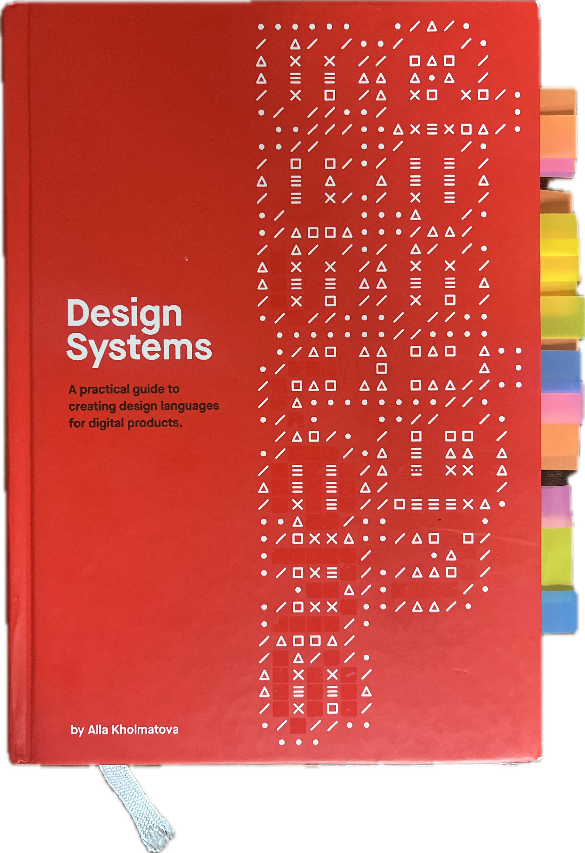
by Alla Kholmatova
Learnings
I could write a separate case study on all the lessons I learned on this project, but I’ll narrow it down to just three.
- Stay Organized & Log Progress
Each and every milestone in this project should have been documented so that I could refer back to it later when writing this case study.
- Do Research
I spent entirely way too much time designing UI screens that weren’t validated by user research only to go back and learn that the screens and features I had spent hours on made no sense. There was a point in this project where I had to throw away my initial design and start from scratch, but only after I conducted enough research to truly understand the needs of my users.
- Design Atomically
Doing the proper amount of usability testing allowed me to see firsthand the patterns and behaviors of my users. Once I understood the core journey of my users I was able to rebuild my screens atomically, completed with a foundation for making quick changes like switching out components, and going from dark mode to light mode.
While the final designs aren’t perfect, I’m ready to close this project and apply the UX fundamentals I learned here to my next case study.
Books that helped me through this project
Reach me at:
karsonhallaway@gmail.com
Work
Toto: Dog Walking App
UMS App Redesign